Please bear with me, as this is my first tutorial.
This tutorial was created with GIMP 2.4.2, there are some differences for previous versions. Also, this tutorial is a revamp of a translation of another tutorial that I found on the internet which was originally in German. I cleared up some confusion that the original English speaking poster had inadvertently added.
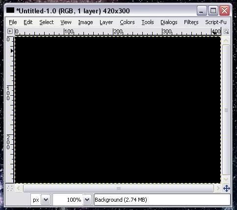
To start off with, create a new image with a black background, like so:
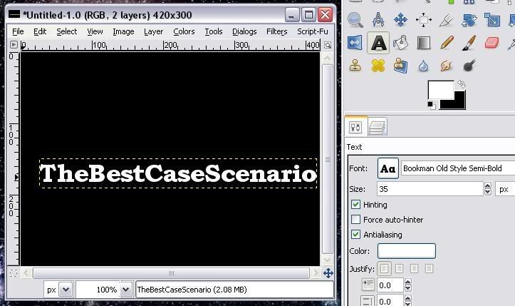
Select your text style, set color to white, and shoot for a minimum size of 35 px. For this tutorial, I have chosen Bookman Old Style Semi-Bold for the font and in a shameless plug, typed TheBestCaseScenario in as my text.
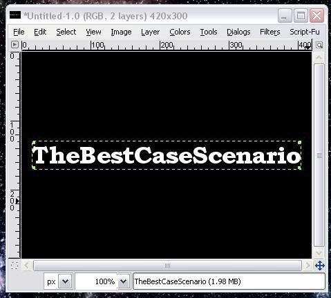
To center the text, click the alignment tool. Select the text, and then click both 'Align Center of Target' and 'Align Middle of Target'. Your text should now look somewhat similar to this:
Be sure to merge your text layer down at this point, or else you'll be scratching your head wondering why this isn't working.
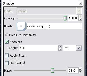
Now for the real fun. Select the smudge tool (it's the index finger pointing down and to the left). Select Fuzzy Circle(7) as your brush, and click Fade out. For sake of simplicity, I've left the Fade out length set at 100 px; adjusting this variable will make your flames either longer or shorter. Also, be sure to set the Rate to 75. Your toolbar should look like this:
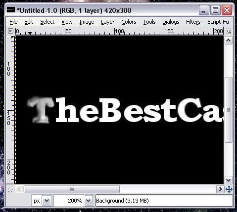
Now that that's done, start smudging the white areas of the text. Don't worry if you go outside the lines, as this is one of the few times in life where sloppiness is not only accepted, but encouraged as well!Here's something similar to what you should have at this point:
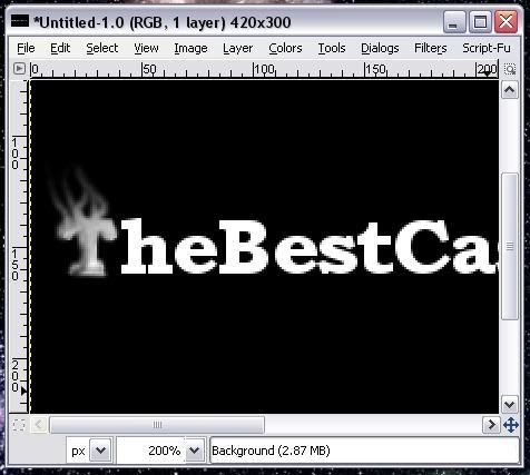
Now, you can chose to smudge the rest of your text and then add flames, or add flames as you go. I've added flames to the 'T' here:
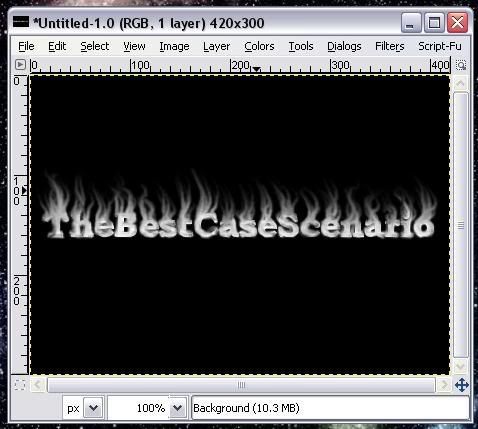
And this is what it looks like when you've completed this part:
A note on the flames: I've found that dragging the mouse in an S pattern works best. Also, you'll notice that if you do a flame just once, it won't reach that high. Go over it a few more times to lengthen it.
Finally, we're going to add some color. Select the 'Colors' drop down menu, and click on 'Color Balance'. There's three radio buttons labeled Shadows, Midtones, and Highlights. Here's the settings:
Shadows
100
30
-30
Midtones
100
30
-30
Highlights
100
0
-100
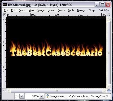
And the final result:
Enjoy!


