Hi all,
I have been writing a firewall program for quite a while now, i was wondering which one looks best for the splash?
Fire1:
Or
Fire2:

Fire1
Fire2


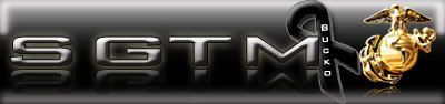
Hi all,
I have been writing a firewall program for quite a while now, i was wondering which one looks best for the splash?
Fire1:
Or
Fire2:
Mary had a little lamb. It bumped into a pylon. Ten thousand volts went up its arse and turned its wool to nylon!

Fire2. It goes better with the lock. But, maybe touch up the text a little, in it's current state it's a tad hard to read the way it all melts together with the flames.
RIP Bucko
here, i've cleaned up the text a bit, added a soft glow, and a stroke around the letters:
Mary had a little lamb. It bumped into a pylon. Ten thousand volts went up its arse and turned its wool to nylon!

I like fire2. The stroke looks a bit harsh, even at that opacity. Maybe try a black outer glow (at low opacity) instead to take the edge away from it?


fire2 after you fixed it.
"...Dumb all over, A little ugly on the side... "...Frank Zappa...

My vote goes for Fire2 (before or after or Greco's, but if I had to choose one, Greco's).
Cool splash screen either way. ^_^
People are stupid; given proper motivation, almost anyone will believe almost anything. Because people are stupid, they will believe a lie because they want to believe it's true, or because they are afraid it might be true. Peoples heads are full of knowledge, facts, and beliefs, and most of it is false, yet they think it all true. People are stupid; they can only rarely tell the difference between a lie and the truth, and yet they are confident they can, and so are all the easier to fool.


I dig this one. The only other thing I would suggest is some kind of gradient or even solid color fill on the text. Even with the stroke around it, it's a little hard on the eyes.Originally Posted by XcOM

Fire1, yep.
Font is clearly visible, the lock is very noticeable, all is well.
The original fire2 is ok, but the white just bleaches out the edges of the text and hurts my eyes.
Xcom's second attempt... shadow between fire and letters? wtf?
greco's makes the already bad text in Fire2 worse, and makes the edges of the lock choppy, without the effect, the lock flows better.
just my opinions, no offense to anyones art.
after taking your ideas onboard, here is two more designs based on comments:
fire4:
and fire5:
Mary had a little lamb. It bumped into a pylon. Ten thousand volts went up its arse and turned its wool to nylon!
 Posting Permissions


 Reply With Quote